
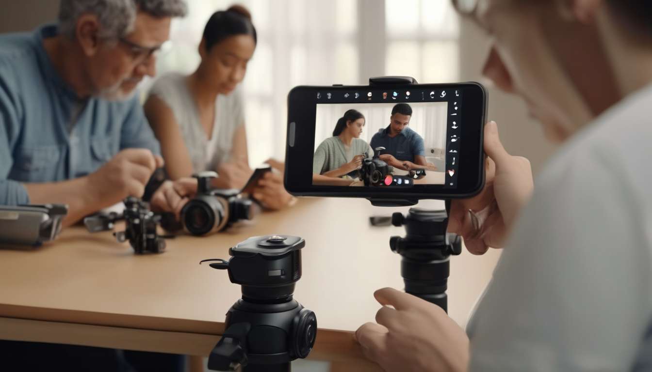
From recent surges in smart-device adoption to platform mandates for inclusive content, we are witnessing a pivotal moment where accessibility and adult photography converge.
As more creators, platforms, and audiences demand equitable experiences, we recognize how design choices—captioning, adjustable contrast, tactile controls, and privacy-forward UI—reshape who can participate and how comfortably they do so.
We have seen policy shifts and feature rollouts that no longer treat accessibility as optional but as integral to product success.
This trend compels us to reassess workflows, reframe user testing, and prioritize diverse needs from the outset.
Together, we can transform the adult photography ecosystem into one that respects autonomy, consent, and dignity while expanding market reach and improving satisfaction.
In this article, we will explore practical design strategies, real-world examples, and measurable benefits that demonstrate how accessibility-centered thinking enhances the user experience for creators and consumers alike.
Accessibility Principles Overview
Core accessibility principles for adult photography:
Perceivable, Operable, Understandable, and Robust (POUR).
Perceivable:
- Provide captioning and transcripts for audio descriptions so people who are deaf or hard of hearing can access spoken content.
- Offer clear, meaningful text alternatives (alt text) for images so users with visual impairments or screen readers can understand visual content.
Operable:
- Ensure predictable navigation and full keyboard support so users who cannot use a mouse can move through content reliably.
- Include tactile or haptic feedback for interactive controls to aid users who rely on touch or physical cues.
Understandable:
- Use plain language, concise labels, and clear consent flows to reduce confusion.
- Offer contextual help and guidance during actions (for example, uploading, consenting, or setting privacy) to build trust and lower barriers.
Robust:
- Use standard, well-supported markup and follow web standards to ensure compatibility with assistive technologies.
- Test across multiple assistive tools and platforms to keep experiences reliable over time.
Shared responsibility and community collaboration:
- Treat inclusive photography accessibility as a collective obligation among creators, platform designers, moderators, and community members.
- Listen to feedback from people with disabilities and iterate on features and policies to balance intimacy, dignity, and accessibility.
Inclusive Visual Design
We’ll design visuals that work for the widest possible range of bodies, abilities, and contexts by prioritizing contrast, clear focal points, flexible layouts, and descriptive alternatives.
We choose color palettes and typography that keep subjects legible for people with low vision and color differences, and we test compositions so faces and gestures stay visible across scales.
We’ll frame shots to respect body diversity and avoid cropping that erases context or identity.
We pair images with accessible metadata and concise captioning/transcripts where appropriate so people can quickly grasp content and intent.
We’ll include options for simplified layouts and adjustable spacing so users can control density without losing meaning.
Interactive elements will be designed with large targets and consistent affordances.
- We’ll provide clear visual states (hover, focus, pressed).
- We’ll ensure touch targets meet size recommendations.
- We’ll offer tactile haptic controls for users who rely on touch feedback.
We’ll involve diverse users in review cycles, listen to their needs, and iterate designs together—because belonging grows when visuals are made to include, not exclude.
Captioning and Transcripts
We provide clear, concise captions and full transcripts so people can quickly understand image content, context, and any spoken or ambient information.
Who is pictured, what actions occur, and why those details matter are described in plain language that welcomes everyone.
Our captioning and transcripts follow consistent labels for speakers, sounds, and timing so users can scan or search efficiently.
We link descriptions to tactile haptic controls and other interface cues so people using touch feedback or screen readers feel connected to the photo experience.
We do not assume sighted norms; instead we offer multiple caption lengths so individuals can choose what fits their needs:
- Short summaries for quick scanning.
- Expanded transcripts for full context and nuance.
We encourage community contributions and respectful editing to ensure captions represent identities and consent.
By centering inclusive photography accessibility in our workflow, we create an environment where all participants belong, access is reliable, and photographic moments are shared with dignity and clarity.
Adjustable Contrast Options
We provide adjustable contrast options so users can quickly tailor image brightness and contrast to their vision needs and viewing conditions.
We offer simple presets and fine-grain sliders that respect personal preferences and make images feel welcoming rather than clinical.
By tying contrast controls to profiles, we let people save settings for different environments—low light, bright sunlight, or high-detail inspection—so everyone feels seen and supported.
We integrate these controls with broader inclusive photography and accessibility practices.
- We ensure caption and transcript text remains readable against modified backgrounds.
- We make on-screen text scale appropriately with contrast adjustments.
Our interface clearly labels defaults and reset options, and we include short guidance so new users can learn without frustration.
We avoid assuming one-size-fits-all solutions; instead, we invite feedback and iterate on contrast ranges and label language.
While we coordinate with tactile/haptic controls teams for cohesive experiences, our contrast features stand independently, giving people direct, immediate control over how images look and helping them belong in the visual conversation.
Tactile and Haptic Controls
We provide tactile and haptic controls that give users immediate, physical feedback for camera actions and image adjustments.
This lets people who rely on touch compose, confirm, and customize photos with confidence.
We design textured buttons, raised edges, and distinct click patterns so everyone feels where controls are and what they do.
Our tactile haptic controls map consistently to core functions—shutter, zoom, flash, and mode—so muscle memory builds and anxiety drops.
We pair vibrations with brief audio cues and optional captioning transcripts of on-screen prompts to ensure multisensory confirmation for users with mixed abilities.
We involve diverse adults in testing, and we iterate until controls feel intuitive and welcoming rather than clinical.
We prioritize inclusive photography accessibility by balancing force, frequency, and duration of feedback to prevent fatigue while remaining informative.
We provide customizable sensitivity settings so each person can set feedback to their comfort level.
By centering belonging and practical needs, we make photography more approachable, reliable, and joyful for everyone who wants to capture moments.
Privacy-Forward Interfaces
We design privacy-forward interfaces that give users clear control over who sees their photos, when metadata is shared, and how long images are stored.
We create simple, community-centered settings so everyone feels included and safe.
Privacy options are phrased in plain language, with defaults that protect people with diverse needs and abilities, supporting inclusive photography accessibility across skill levels.
We let users manage captioning, transcripts, and visibility per image or album, so descriptive text stays with trusted audiences only.
- Controls for captions and transcripts are available per-image and per-album.
- Visibility settings let users choose precisely who can see descriptive text.
Controls for metadata and sharing timelines are grouped logically, reducing cognitive load and reaffirming belonging through predictable behavior.
- Metadata controls (location, device, timestamp) are colocated.
- Sharing timelines (auto-expire, scheduled share, indefinite) are presented as a single grouped control.
Where tactile haptic controls are available, we ensure they reflect privacy state — distinct patterns confirm locked or public modes — helping users who rely on touch feel confident about choices.
- Haptic patterns are consistent and discoverable.
- Physical indicators map directly to on-screen states.
We provide clear feedback after changes, concise explanations for each option, and easy ways to revert decisions.
- Immediately confirm changes with short, plain-language messages.
- Offer one-tap undo for recent changes.
- Include brief help text for each control.
By centering consent, clarity, and sensory access, we help communities create and share photos on their own terms.
Inclusive User Testing
Recruit diverse participants and test across contexts.
We’ll recruit participants with a wide range of abilities, devices, and real-world contexts to ensure accessibility and comfort.
Include people with varied sensory, motor, and cognitive profiles so everyone feels seen and safe during sessions.
Center inclusive photography accessibility by observing how participants:
- frame shots,
- interact with controls, and
- express comfort with content creation and consumption.
Collect both qualitative feedback and objective measures.
We’ll gather qualitative insights and objective metrics — task completion, error rates, and time-on-task — so decisions are evidence-based.
We’ll provide captioning transcripts for recorded sessions and use them to confirm that language, prompts, and metadata work well for screen reader users and people who prefer text.
Prototype and iterate on alternative controls.
We’ll prototype tactile haptic controls and gesture alternatives, iterating until movement and feedback are reliable across devices.
Foster collaboration and convert findings into action.
We’ll create a collaborative environment where participants help shape solutions, not just evaluate them.
We’ll synthesize findings into actionable design changes, prioritizing fixes that:
- increase participation,
- reduce friction, and
- strengthen community trust.
Business and Ethical Benefits
By designing accessible adult photography experiences, we open new markets, reduce legal risks, and build trust with users who value safety and dignity.
We create inclusive photography accessibility that welcomes people with diverse bodies, abilities, and preferences.
That sense of belonging increases engagement and loyalty.
We’ll see clearer revenue streams when content is made discoverable.
Examples:
- Captioning, transcripts, and rich metadata that improve search and recommendations.
- Tactile or haptic controls that provide alternative interaction modes for people with sensory or motor differences.
We’re also protecting the business through compliance and responsible practices.
Benefits:
- Compliance with accessibility standards reduces litigation risk.
- Signals social responsibility to partners and investors.
Ethically, accessible features affirm consent and respect.
Core features include:
- Clear captions and transcripts.
- Alternative text for images.
- Adjustable controls for pace, intensity, and sensory feedback.
Practically, accessible design lowers ongoing costs.
Why:
- Fewer users encounter barriers that require support.
- Reduced support volume and faster issue resolution.
When we prioritize accessibility, we’re not just meeting legal and market demands — we’re building a community where everyone feels seen, respected, and empowered to participate safely.
How can accessibility features for adult photography apps be customized for different cultural norms and legal restrictions across countries?
We’re asking how to adapt accessibility features across cultures and laws.
Map local regulations and cultural norms.
- Identify relevant accessibility laws, standards, and enforcement practices in each region.
- Catalog cultural norms that affect perception of disability, privacy expectations, and acceptable imagery or language.
Involve diverse users and regional consultants.
- Conduct user research with people from varied cultural and disability backgrounds.
- Engage local accessibility experts, cultural consultants, and legal counsel to validate approaches.
Let users choose content filters, language, and consent flows.
- Provide user-selectable content filters for imagery, audio, and sensitive topics.
- Offer language and localization options for text, audio, and UI.
- Design consent flows that match regional legal requirements and cultural expectations.
Build configurable defaults per region.
- Implement region-based default settings that prioritize local legal compliance and common cultural preferences.
- Allow users to override defaults easily.
Ensure clear opt-ins and transparent controls.
- Use explicit, context-specific opt-in controls for features that impact privacy or exposure to sensitive content.
- Present concise explanations of what each choice does and its consequences.
Offer alternative descriptions and symbols that respect local sensitivities.
- Provide multiple alt-text options, simplified descriptions, and culturally appropriate symbols.
- Avoid imagery, metaphors, or icons that could be offensive or misleading in a given culture.
Monitor feedback and update features to stay compliant, inclusive, and welcoming.
- Collect ongoing user feedback and regional incident reports.
- Regularly review legal changes and cultural trends and update settings, defaults, and content guidelines accordingly.
What are best practices for moderating user-generated adult content while ensuring accessible reporting and appeals processes for users with disabilities?
Goal: Balance firm moderation with accessible reporting and appeals for users with disabilities.
Set clear, consistent policies.
- Publish plain-language policies and definitions of prohibited conduct.
- Provide accessible policy documents (WCAG-compliant HTML, tagged PDFs, and text-only versions).
Provide multiple reporting channels.
- Text-based reports (web forms that support screen readers and keyboard navigation).
- Voice reporting (phone lines and voice-to-text options).
- Accessible forms (large-print, high-contrast, simple-layout versions and compatibility with assistive tech).
Ensure appeal paths include assisted support and alternative formats.
- Offer assisted appeals (human support via phone, video relay, or live chat with trained staff).
- Accept appeals in multiple formats (email, recorded audio/video, or caregiver/advocate submissions with consent).
- Provide clear, accessible instructions for submitting appeals.
Train moderators on disability needs.
- Regular training on disability awareness, communication best practices, and reasonable accommodations.
- Role-specific guidance for recognizing accessible reporting and appropriately routing assisted appeals.
Keep timelines transparent and provide accessible status updates.
- Publish standard processing timelines and what each stage means.
- Send status updates in the claimant’s preferred accessible format (email, SMS, voice call, or accessible portal).
- Provide estimated response times and escalation pathways.
Involve disability advocates and iterate based on feedback.
- Establish an advisory panel of disability advocates for policy review and testing.
- Collect and analyze accessibility-related feedback and complaint data.
- Iterate policies, training, and tooling based on real-world use and measurable outcomes.
Key operational safeguards.
- Maintain privacy and consent standards for assisted reporters/appeals.
- Log accommodations requested and provided to ensure consistency.
- Monitor for disparate impact on disabled users and remediate proactively.
If you’d like, I can draft sample accessible report and appeal form templates, a moderator training checklist, or a short user-facing policy section that explains the process in plain language. Which would be most useful?
How should developers handle biometric or face-recognition features to respect both inclusivity and the heightened privacy needs of adults depicted in intimate imagery?
Do not require biometrics or face recognition as a condition of use.
Offer clear opt-in and granular controls. Provide users with explicit, separate choices for enabling biometric features, and let them toggle specific capabilities (for example, face blurring, identity recognition, or automated tagging) independently.
Default to privacy-preserving modes. Prefer on-device processing, local models, or end-to-end encryption by default so sensitive data is not exposed to external servers unless the user explicitly opts in.
Make explanations accessible and actionable. Use plain language to explain what each feature does, what data it accesses, how long data is kept, and the risks and benefits. Include short examples and FAQs for common concerns.
Provide easy opt-out and data removal. Allow users to revoke consent at any time and to delete any biometric-derived data (models, templates, or metadata) associated with them, with clear instructions and immediate effect where possible.
Be transparent about retention, sharing, and third parties. Clearly disclose retention periods, whether data is shared with vendors or law enforcement, and the legal bases for any sharing.
Subject systems to independent audits and governance. Regularly audit algorithms, data practices, and access logs for fairness, accuracy, and privacy; publish summaries of findings. Establish consent-driven governance with user representation to guide policy changes.
Prioritize dignity and trust. Design features to minimize coercion and harassment risks (for example, avoid defaults that make people identifiable in intimate imagery), and adopt safe default settings that protect vulnerable users.
Conclusion
You’ve seen how accessibility design makes adult photography better for everyone.
By using inclusive visuals, clear captions, adjustable contrast, tactile controls, and privacy-forward interfaces, you make content more usable and respectful.
Testing with diverse users ensures real needs are met, while ethical approaches build trust and business value.
Embracing these principles isn’t just compliant — it’s smart design that:
- Broadens reach
- Improves experiences
- Shows you respect every viewer’s dignity and preferences